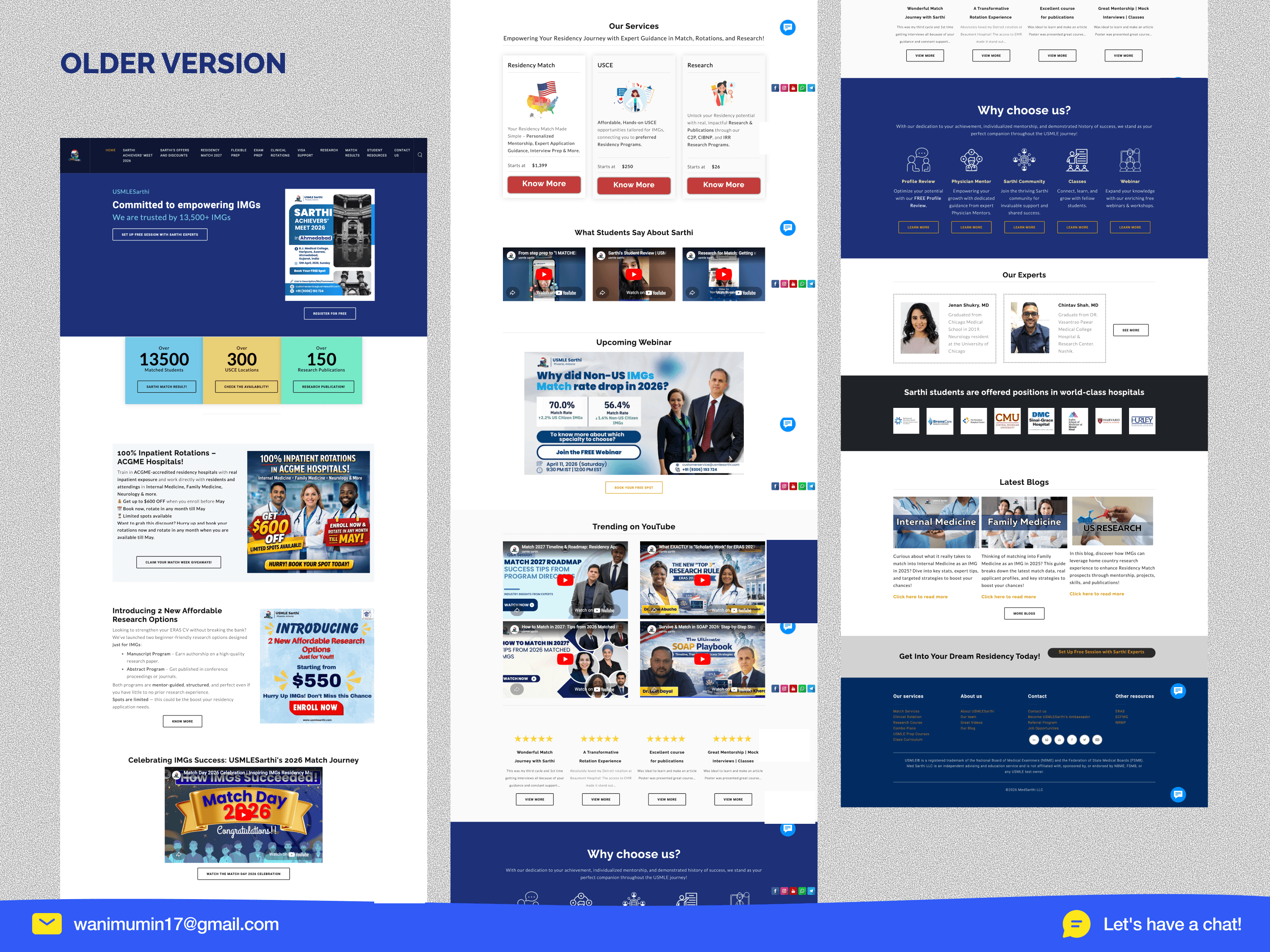
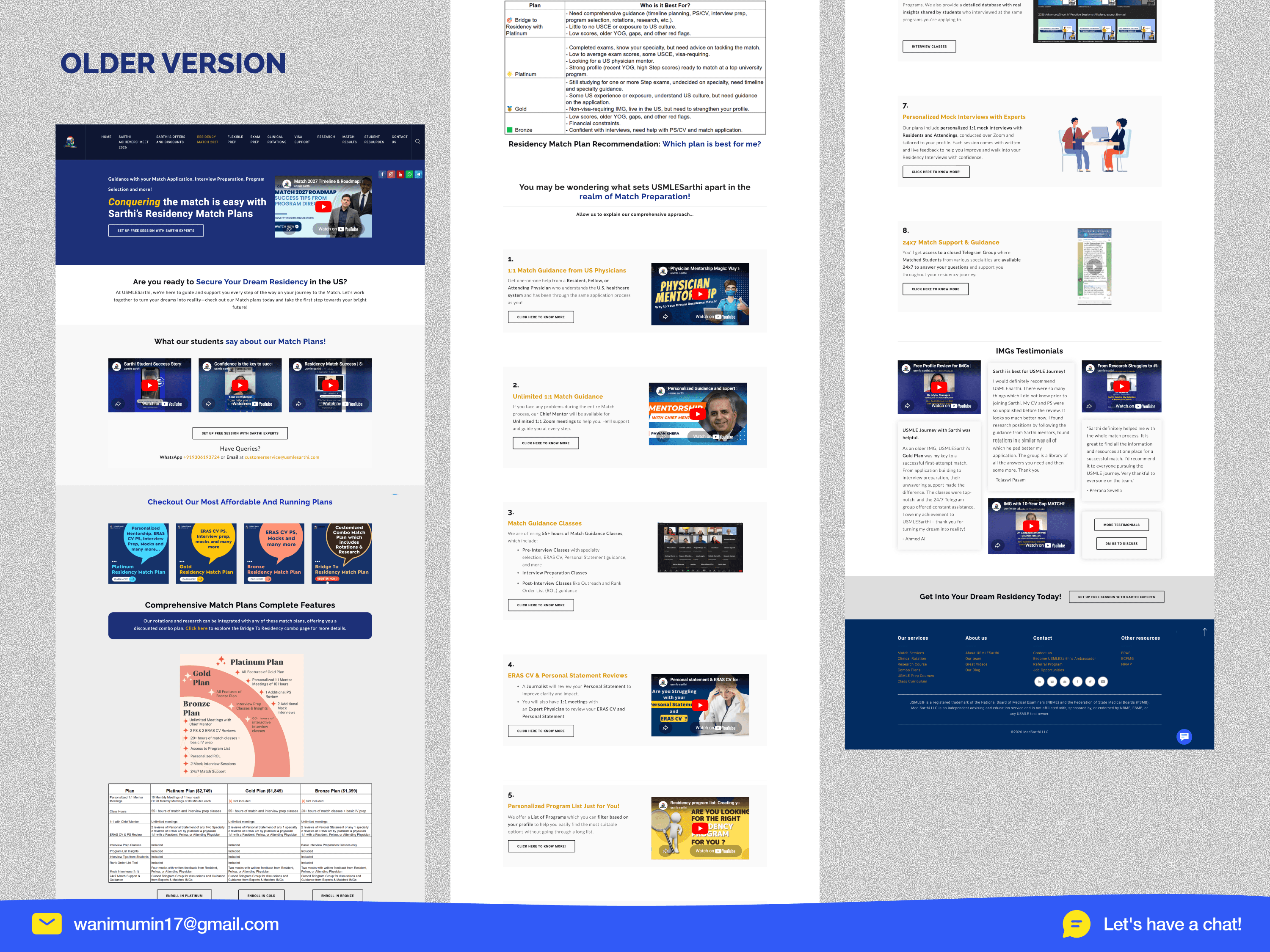
Redesigning USMLE Sarthi's Digital Experience.

13,500 medical graduates trust USMLE Sarthi to help them match into US residency programs. Their students have been placed at Harvard, Mount Sinai, and Central Michigan. They've matched 500+ doctors. Their reputation is spotless. Their website told a different story. Built on Weebly using HTML table layouts, the site felt like 2010 cluttered navigation with 13+ items, 8 competing CTAs fighting for attention on every page, pricing scattered across 4 separate pages, and zero mobile responsiveness. The most persuasive content (500+ matched students, world-class hospital partnerships, real testimonials) was buried under layers of noise. The result? Students who found Sarthi through referrals were converting. Students who found them through the website were bouncing. I led the complete redesign. Not a visual refresh a structural rethinking of how 13,500 users navigate, evaluate, and decide to invest $1,399–$2,699 in their medical career. My approach: I audited the full existing site (30+ pages), analyzed 5 competitor platforms, mapped the primary user journey, and identified that the core problem wasn't design it was clarity. Every design decision that followed was built around one goal: get a stressed medical student from "I'm confused" to "I'm ready to talk to someone" with the fewest possible clicks.

Challenge

• 13+ navigation items, zero direction. The site tried to show everything at once match services, exam prep, rotations, visa support, research programs, events, blogs, referrals, and contact all in the main nav. A first-time visitor had no idea where to start. For a student making a high-stakes, $2,699 decision under pressure, this navigation was a wall, not a door. • 8 competing CTAs destroying conversion. A single page had "Set Up Free Session," "Register for Free," "Claim Giveaways," "Know More" (repeated 3 times), "Enroll Now," and "Book Now" all competing for the same click. When everything is a priority, nothing is. The site didn't know what it wanted users to do, so users did nothing. • Incredible proof hidden in plain sight. 500+ matched students. Partnerships with Harvard, Mount Sinai, Beaumont. 13,500+ students served. Real WhatsApp testimonials. Real video reviews. All of it buried below 3+ scrolls, scattered randomly, mixed in with promotional banners and YouTube embeds. The most convincing content on the site was the hardest to find.
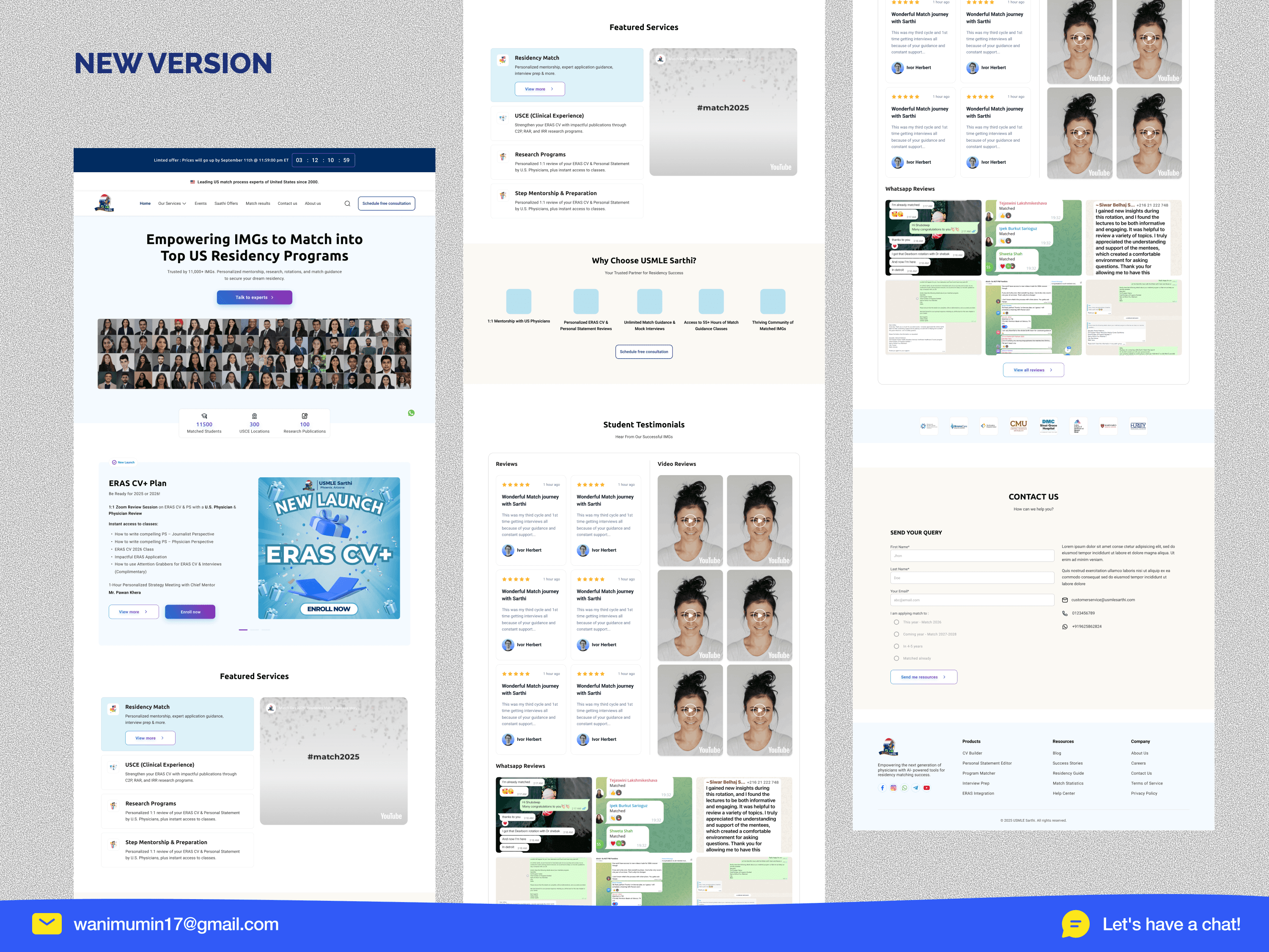
Outcome

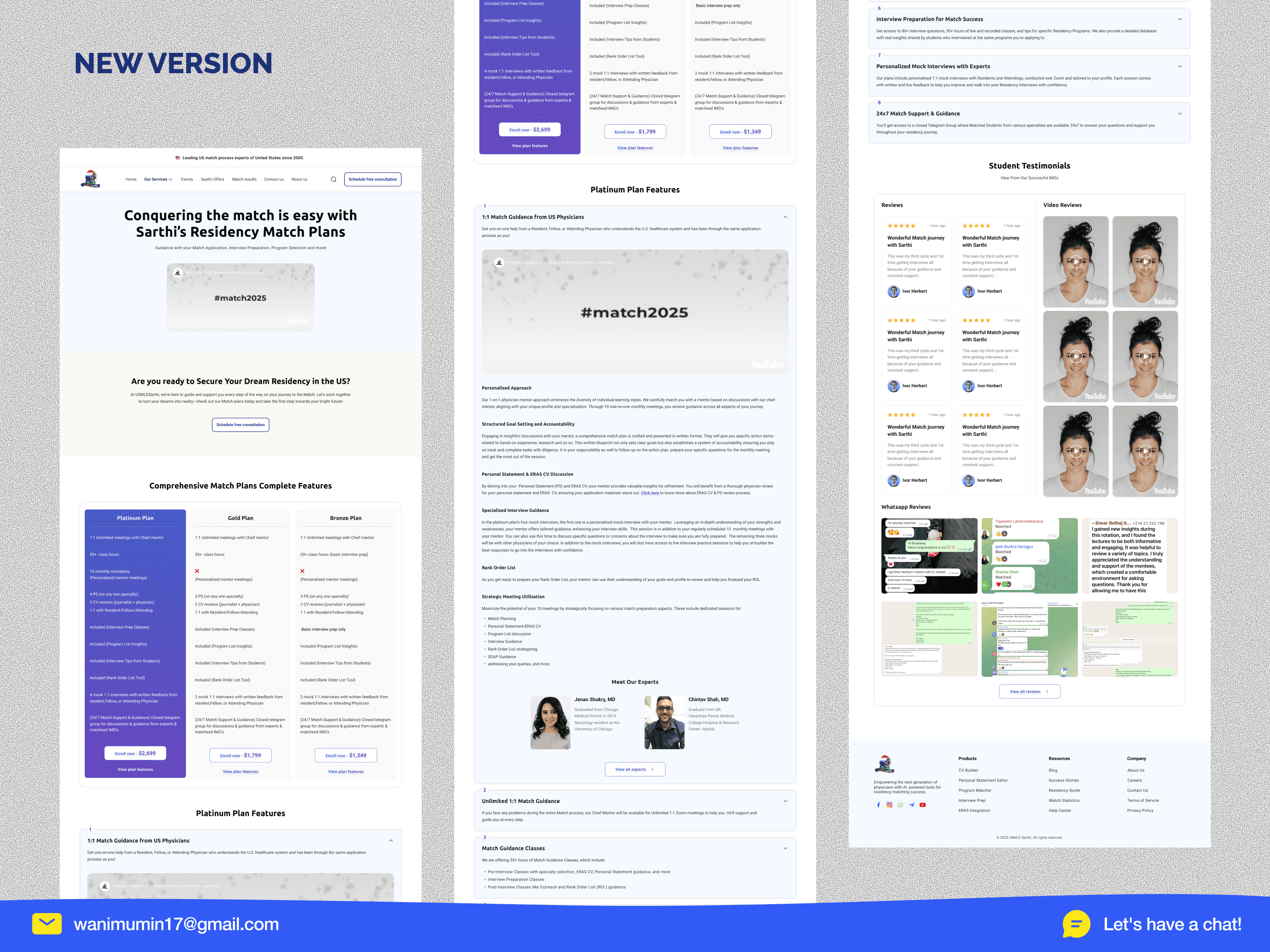
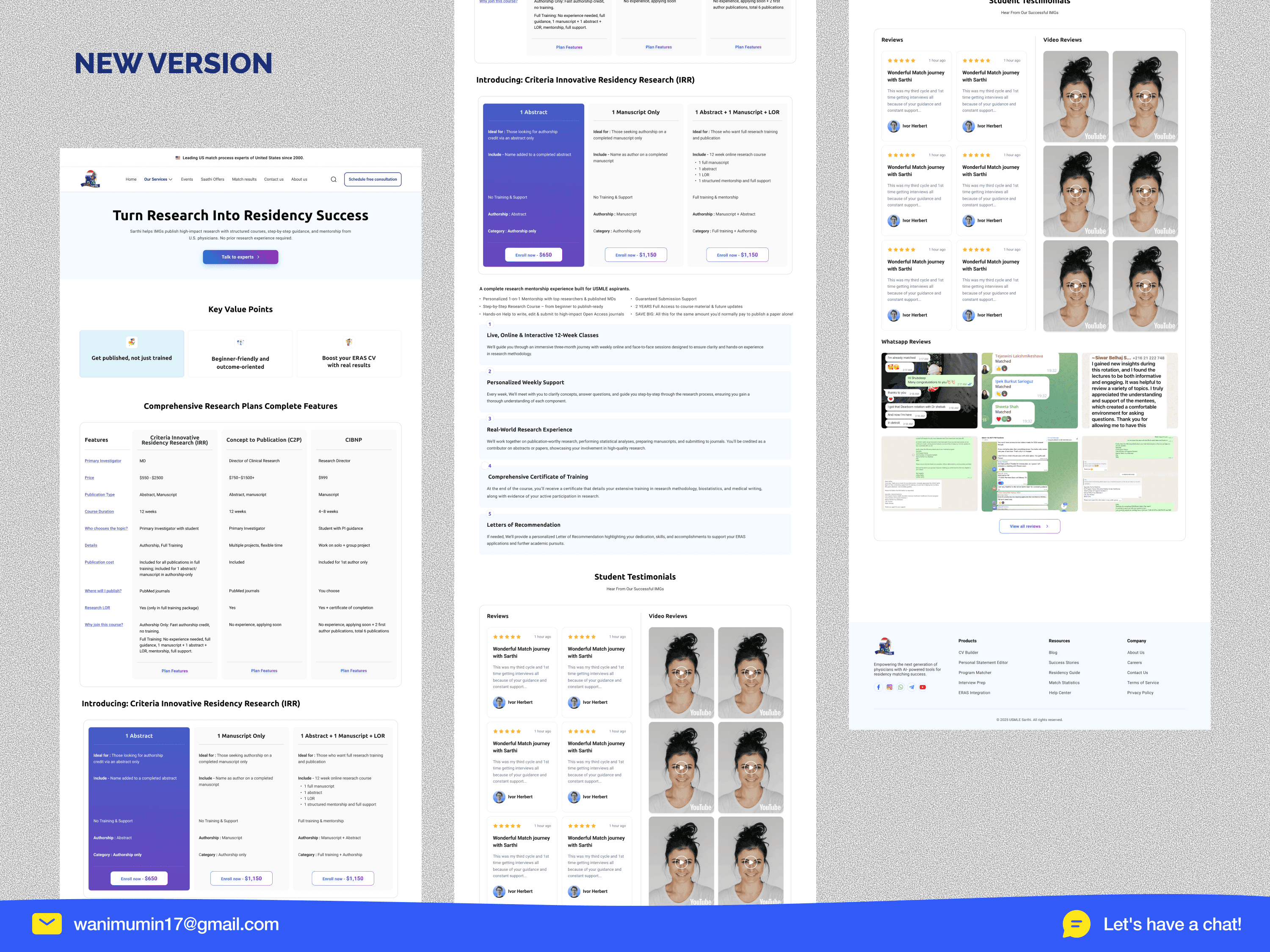
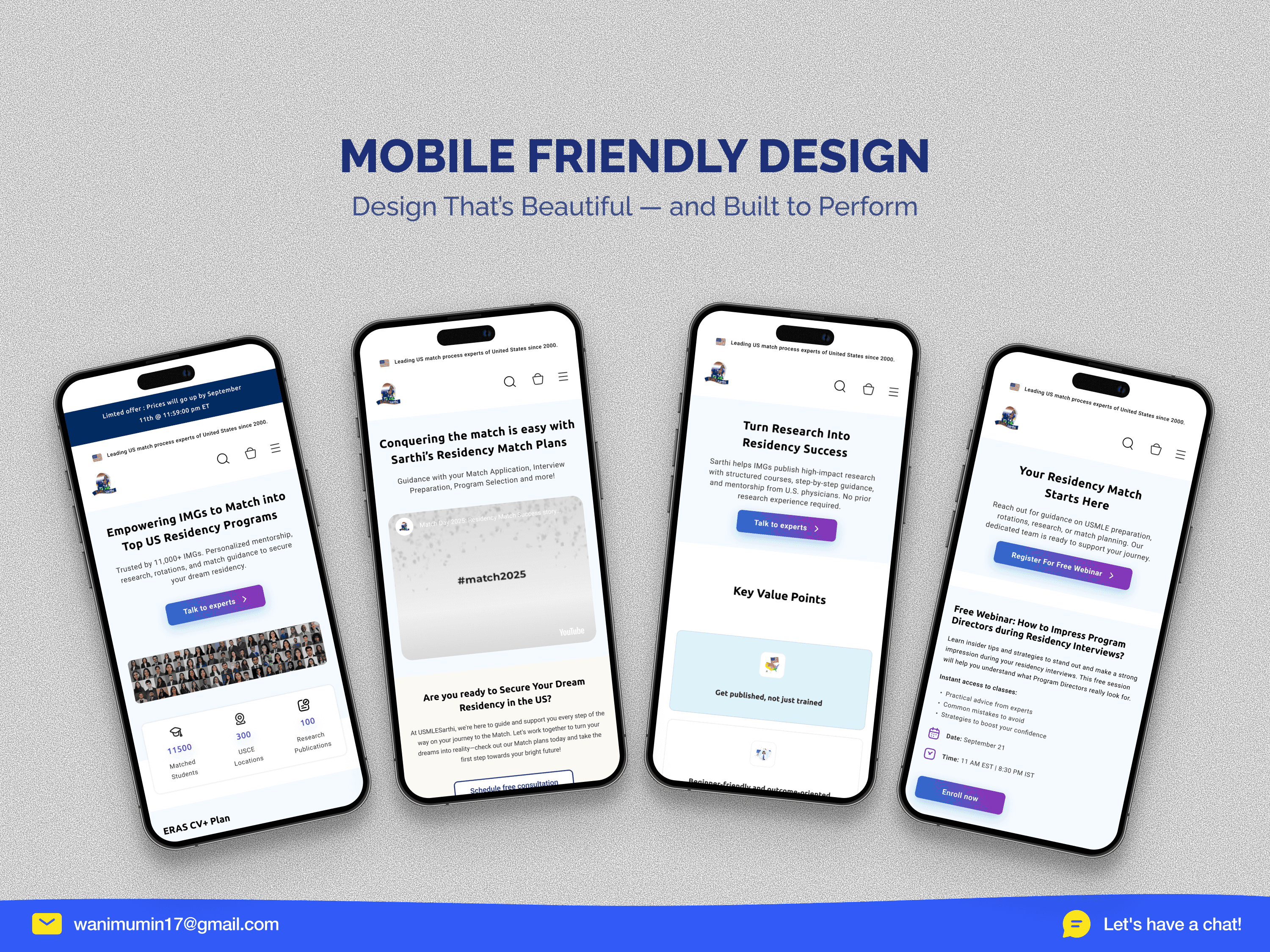
• Navigation cut from 13 to 7 items (46% simpler). Restructured the entire information architecture. Pulled "Schedule Free Consultation" out of the nav and made it a persistent header button always visible, always one click away. Pricing consolidated from 4 separate pages into one side-by-side comparison view (Platinum / Gold / Bronze), eliminating the need to visit multiple pages to make a decision. • Trust moved above the fold, organized by proof type. Social proof now appears in three formats written reviews with star ratings, video testimonials, and raw WhatsApp screenshots each addressing a different trust threshold. Match results categorized into 6 student-specific groups (Old YOG, Recent YOG, Less IVS, Low Scores, Gap, Visa Seeking) so every visitor finds someone exactly like them who matched successfully. • Consistent design system across 10+ pages. Unified typography, spacing, color system, and reusable components replaced the visual chaos of the old site. Full mobile responsiveness replaced broken table-based layouts. The website now reflects the caliber of a platform trusted by 13,500+ medical graduates and partnered with world-class institutions.

Join 3500+ professionals elevating their brand

Discover design insights, project updates, and tips to elevate your work straight to your inbox.

Unsubscribe at any time.

Join 3500+ professionals elevating their brand

Discover design insights, project updates, and tips to elevate your work straight to your inbox.

Unsubscribe at any time.

Black and white portrait of a man with a beard and glasses

Mumin Wani

UI/UX designer, no-code developer

Contact

Fill out the form, or reach out directly. I’ll respond within 24 hours.

© Copyright 2026. All rights Reserved.

Thanks for Exploring

Black and white portrait of a man with a beard and glasses

Mumin Wani

UI/UX designer, no-code developer

Contact

Fill out the form, or reach out directly. I’ll respond within 24 hours.

© Copyright 2026. All rights Reserved.

Thanks for Exploring

Create a free website with Framer, the website builder loved by startups, designers and agencies.